
For all you who read the last page of a book first to find out the ending (P.S. I love you), I'll spare you the suspense... contrary to belief, infographics are not dying, long from it. But, they are currently undergoing a metamorphosis with the evolving digital landscape.
Long form informational graphics have been a shining star for content creators for the last decade, think “social media.” With our systems continuing to complex, the need for this communication tool has never been greater. But, the most common approach to infographics that we know as familiar, is fading. This transformation is happening with the aggregation of our consumption preferences. And with this shift, the creative tool kit is being reinvented. Let us take a closer look at the constructs of this amazing story telling tool worth revitalizing.
What is an infographic?

A process style infographic from the Daily Infographic.
The name tells us a lot about its function, information graphics, infographics. Data experts join forces with designers to visualize data into a consumable story, using type, numbers, illustrations and visual hierarchy to bring that story to life. Today they are everywhere, in our products, apps, social feeds, presentations, and news. The most common types of infographics include: data visualization, anatomy, process, timelines, comparisons and maps.
Infographics got it “going on”
Infographics solve for both form and function. They support the translation of multiplex data into something comprehendible for my first grader. But, they are also alluring to look at. In the early 2000's, I discovered GOOD magazine. I would spend hours pouring over the bewitching infographics they published on the most obscure and fascinating subjects. For me, the writers/publishers of GOOD were the ones that made me fall in love with data visualization. They sparked the potential infographics had, and how I came to adopt the approach.

Jessica Hische's flow chart style infographic on “Should I work for free?” designed using entirely CSS/HTML.
Scientifically they work

Infographics appeal to human’s visual nature.
Infographics trace back to cave people. And there is a scientific reason why this form of story telling has endured the test of time. Humans are by nature visual. According to the University of Minnesota, “90% of information transmitted to the brain is visual.” The research they conducted revealed that “presentations with visual elements are 43% more efficient and persuasive compared to unaided presentations.”
According to Dr. Lynell Burmark, education consultant who writes and speaks about visual literacy:
“…unless our words, concepts, ideas are hooked onto an image, they will go in one ear, sail through the brain, and go out the other ear. Words are processed by our short-term memory where we can only retain about seven bits of information (plus or minus 2). Images, on the other hand, go directly into long-term memory where they are indelibly etched."
The revitalization
More data, plus more devices means infographics are simplifying and data visualization is the new go-to infographic approach. The old approach of large, long detailed infographics is fading as it gets complicated fast in a fluid environment.
Take a look below for some of the latest trends you can easily adopt in your next project containing infographics.
Tips for using infographics in a fluid environment:
1. Infographic libraries.
JavaScript charts like AM charts and FusionCharts make data visualization style infographics more accessible for mobile and web. If you are short on time and resources, these out of the box elements can give your project access to infographics without being handcuffed to a designer.

A great example from Selecto utilizing data visualization in mobile.
2. Prioritize and simplify.
Simplicity is always a great approach to a complex problem. But, be conscious and thoughtful about what you choose to visualize. It is our journalistic responsibility to accurately depict information, especially from a “quick scan” perspective.

An example of data visualization with interaction from Shixie, created for IBM.
3. Consider interactions.
Consider more simplified design elements with interactions to add more layers and interest. Adding “play” or elements a user can interact with can be incredibly powerful and memorable when done right.
Associate UX Designer Darvinder Singh Kochhar comments on interactions in product design. “Beyond basic text on a screen, adding interactions allows me to create a more emotional experience for the user. Like with a weather app, if you show snow falling, the user will generate feelings around that story, and most likely it will stick with them longer.”
4. Strategize and plan.
While complex infographic are slowly loosing popularity, they are still a top performer in many channels. And while they can take time to set-up, planned well they can be repurposed. The invested time will pay off if you can “hit a few birds with one stone.” Consider breaking down a large infographic into smaller chunks that will easily translate to content on social media, blog, or email.
Principal Consultant Chad Currie comments, “The monolithic infographic is dead. Readers want small, swipe-able bundles of visual insights they can remix, repurpose, and retweet.”
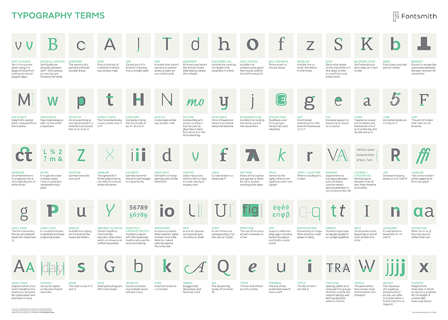

Above an example from Font Smith, of how you could take this more complex anatomy style infographic of type terms to repurpose into bite sized curious content.
The evolving digital environment doesn't mean infographics don't have a place. For designers, it means taking time to strategize an execution and adapting the infographic approach to create and optimal user experience. For more amazing infographic inspiration, check out GOOD. Thanks y'all for years of inspiration.
Some great long form infographics courtesy of GOOD’s archives below.


